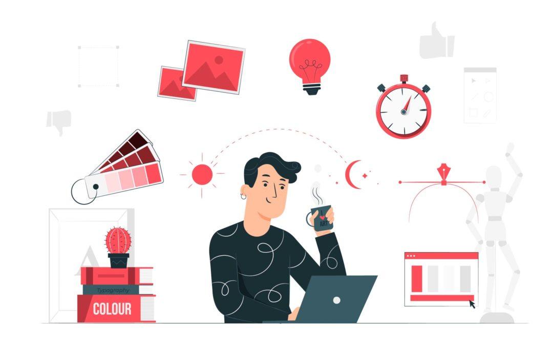
Graphic Design Blogs You Must Read
The process of producing visual content for a particular audience is known as graphic design. Print (books, brochures, billboards, etc.), digital (websites, social media graphics, mobile applications, etc.), and environmental media are all included in the field of graphic design (event spaces, public spaces, etc.).
Using a combination of text, photography, illustration, and color, graphic designers can produce aesthetically pleasing designs and effectively communicate a message. Graphic design can also encompass branding and identity design, developing a visual identity for a business or group.
ELEMENTS OF GRAPHIC DESIGN
In general, graphic design is broad and includes various projects and mediums.
Visual hierarchy: To guide the viewer’s attention across the design and emphasize the most crucial information, graphic designers utilize components like size, color, and positioning.
Typography: Typography is a crucial component of graphic design because it may convey information, establish a mood, and establish a visual hierarchy.
Color Theory: Graphic designers utilize color theory to convey information and set the right mood.
Imagery: Graphic designers employ images like photography, illustrations, and graphics to convey information and provide aesthetic interest.
Balance: Balance is a technique used by graphic designers to produce a steady and harmonious composition.
Contrast: Graphic designers utilize contrast to emphasize points and add visual interest. Graphic designers can utilize proximity to group similar items and establish a visual link.
Repetition: Graphic designers use repetition to establish coherence and consistency among various design elements.
White Space: White space is a tool used by graphic designers to emphasize certain design components and to give the impression of openness and balance.
Adaptability: Graphic designs are increasingly being created with this feature in mind to function well on many platforms, screen sizes, and media types.
Graphic Design Tips for Professional Image Creation
It takes more work than you think to create photos like a pro, from the colors and images you choose to the whole attitude. A graphic design that appears professional is made up of many different components. Fortunately, acquiring the abilities needed to produce precise, attention-grabbing visuals is easy.
Here are some useful graphic design pointers to get you started on the path to producing graphics that will spruce up your online presence and grab the attention of your target audience.
-
Make alignment a conscious effort
For viewers, using deliberate alignment in your visual design is important. You want a part of your design to look normal.Even slight spacing and positioning mistakes will be obvious to observers. You don’t necessarily have to stack things directly on top of one another when you align your graphic design elements.However, they must always be positioned correctly.
Your photographs look much more professional if your design elements are spaced equally and tastefully. When positioning objects, icons, or text blocks, you must follow these guidelines
-
Use Icons and Logos to Illustrate Your Point
Your branded graphics can be significantly improved by strategically placing symbols and logos. A well-placed well-known icon or your logo will give even more of your brand’s flavor to an image and employ your brand’s colors and fonts.
Be strategic when including brands or icons in your visual design.Attempting to push a brand into an image is not a good idea.It should be big enough to read at a glance and have enough space surrounding it to avoid seeming crowded.
YouTube video thumbnails, as well as quotes or branded images, can benefit from logos. Making sure they are readable, recognizable, and appropriate for the design is the trick. If a logo is present, it frequently looks best centered at the top or bottom of the image or in the bottom corner.
If icons are used in advice, quotations, and infographics, they can be quite effective. An excellent example is using a light bulb or lightning bolt to represent a brilliant thought. Emojis can also assist in getting your point through to your audience.
-
Use Contrasting Colors to Draw Focus
Contrasting colors aid in directing the viewer’s attention to the desired area. Additionally, a correctly contrasted palette may guarantee that your designs are both usable and aesthetically beautiful.
Use a color wheel, such as the free Adobe Color tool, if you still need to choose your brand’s colors. You can use this tool to switch between colors and pick a palette with the right degree of contrast that is representative of your brand and eye-catching.
Recently, Adobe Color added a Contrast Checker feature to assist designers in choosing accessible color schemes that adhere to W3CWeb ®’s Content Accessibility Guidelines (WCAG).
For added accessibility, the tool has a mode that can handle three different types of color blindness.
-
Keep in Mind the Negative Space
When designing a picture, you don’t want to stuff it to the gills with text, icons, logos, and stock photos. As a result, the design will appear overly cluttered and be unappealing to viewers.
Negative space surrounds visual elements and is crucial since it enables you to organize information. For instance, it would be challenging to tell where one line of text stopped, and the next one began if two paragraphs were displayed side by side with no negative space between them.
Additionally, a busy design may stress out your customers, decreasing their likelihood of searching for your business online.
Make sure your graphic designs have a lot of negative space by including it in the design. You’ll maintain a neat and appealing visual aesthetic with this method.
-
Reduce Font Choice
Just as crucial as respecting the space in your image is minimizing the fonts you choose.
Use clear and simple fonts to read and stand out against the background you have chosen. (If they are difficult to read against your backdrop image, consider placing a solid shape behind the text as a sort of container, such as a circle, square, or rectangle.)
Except for the logo or brand name you might place in the corner or at the bottom of the image, only utilize up to two fonts in your graphic design. Even so, these fonts must adhere to your brand’s design standards.
Avoid overusing formatting tools like bold or italics. The two-font rule also applies to font formatting. If not, your image will be very cluttered, and readers may decide to skip it rather than read it.
-
Take Your Branded Colors& Aesthetic Into Account
Consider your selected brand colors and aesthetic while making visuals for your company. Your online presence should feel consistent when it comes to colors, style, and typefaces. Your social media graphics creation and sharing practices should reflect this. Make sure the pictures you post are consistent with your branding.
Check out Wordable.io. The color scheme for this brand’s social media visuals should match the cool, minimalistic colors used in the website design. See the color scheme for Breadcrumbs.io as a comparison. It’s very different from Wordable’s aesthetic
For Wordable’s social visuals, using the bright yellow Breadcrumbs.io palette wouldn’t work (and vice versa). It would create a visual conflict with the established brand’s color scheme.
-
To keep the image organized, use lines or boxes
Use boxes, lines, or even shapes to keep things structured in your graphic designs. The focus can be drawn to the desired location by using design elements to divide the text and other portions of the overall image.
Adding lines or boxes is another excellent approach to adding negative space since it keeps crucial information centralized. You should utilize these strategies sparingly, just like you shouldn’t with other design components. Use them selectively and in a way that complements the look and feel of your brand.
-
Examine a variety of alignment techniques
While exact centering isn’t necessary for all elements in graphic design, alignment is still vital. Logos can be positioned in a graphic’s corner, and text can be purposefully divided into two columns.
Ensuring that your design’s content is logically structured and that the graphics and visuals you select appear decent are both crucial.
The icon is oriented to the right in the above example, but the text is aligned to the left. The centering of all the components within the graphic’s confines makes this work.
-
Modify the Elements’ Opacity
In graphic design, changing the opacity or translucence of design elements may be quite effective. For instance, we wouldn’t be able to see much of the topic in the picture behind the form in the image below if it were fully opaque. When the opacity is changed to at least a partial translucence.
You get the contrast you need to make your writing legible, but it also lets the background show through. Finding this balance is essential to producing a polished and superior visual.
-
Think of Mobile
Remember mobile while creating pictures for your brand. Over 90% of internet users worldwide used mobile devices as of 2021.
The same Statista data shows that over 56.89% of internet traffic is also being used on mobile devices. You must recognize the need to optimize your photos for mobile consumers.
Are your photos ready for viewing on mobile devices? Are they optimized for mobile use across platforms, and is the text size large enough to read on a mobile device?
Remember that on mobile, vertical photos are more common than horizontal ones.
-
Be straight forward
Simplicity, clarity, and cleanliness are the keys to effective graphic design. This enables the viewer to quickly scan the material without getting overwhelmed.
Remember to take your time and keep things simple immediately if you’re starting as a graphic designer. Your fans are more likely to love your material when you spend a little more time than usual creating creative and well-planned designs.
They’re more inclined to stick around for more of your brand’s offerings rather than clicking away from a poorly produced image.
FAQ:
-
What makes a graphic designer necessary?
You won’t need a graphic designer if you aim to use desktop publishing software to produce and print your materials from your desktop printer for personal use, such as greeting cards, flyers, or craft projects.
A graphic designer will contribute a thorough understanding of graphic design, its components and guiding principles, and the technical expertise needed to use desktop publishing and image tools.
A graphic designer will also be knowledgeable about setting up files for use by others, such as printers or online web hosts, ensuring the smooth output of your final communication piece.
-
What exactly does a graphic designer do?
A designer is a spokesperson for your concept, end product, and/or solution.
A designer will put your material together with components of color, font, line, space, shape, and balance to create a finished communications piece for your company or organization with training or experience as a visual communicator and problem solution.
A designer will also prepare the “mechanical requirements” for your finished artwork. To ensure the smooth production of a final finished product (such as a printed flyer or a website), prepare it following the requirements of a printer, magazine, Web host, television studio, or any other output medium.
-
Where do designers of graphics work?
Graphic designers use different settings. Some people work for companies that receive client commissions for short-term and long-term initiatives. Others work for publishing houses, advertising firms, broadcasting and television corporations, and multimedia businesses.
Some graphic designers do their independent work from their homes or studios.
-
What graphic designer jobs have the highest salaries?
Web designer, multimedia designer, art director, senior designer, UI designer, UX designer, and creative director are the graphic designer jobs that pay the most.
-
How can I launch a graphic design career?
It is suggested for those who want to pursue a career as a graphic designer to:
- Develop your software talents and pursue formal education.
- Get a job as a freelancer or find an internship.
- Create a platform online to connect with businesses or other designers.
-
What credentials are required to work as a graphic designer?
Most qualified graphic designers hold a foundational degree, a higher national degree, or a degree in graphic design or another form of art, as well as a topic related to design.
Most entry-level and professional graphic design employment typically requires a bachelor’s degree.
-
What qualifications are required to work as a graphic designer?
The following competencies are prerequisites for becoming a graphic designer:
- Creativity
- Communication
- Typography
- Applications for creativity from Adobe
- Engaging media
- Coding
- Branding
- Sending out presentations